
3 types of Binary Options charts and how to read them
Let’s take a look at the most popular binary options charts:
- Line graph
- Bar schedule
- Candlestick chart
Now let’s explain each chart to analyze and predict the movement of an asset, individually, and see what you need to know about each of them.
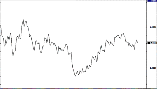
Binary Options Line Chart
A simple line chart has the form of a line, from one closing price to the next closing price. If we draw a point between these two points, we can see the general trend of moving the price of a currency pair over a certain period of time. The chart of the option, or rather the price of the asset, shows the price in each unit of time. Such a chart is convenient to use to determine the trend (the direction of the asset price). Together with binary options indicators, since the moving averages are moving averages, you can build strategies for trading options on the chart.
Example of a line chart for EUR/USD:
Binary Options Bar Chart
The bar schedule is more comprehensive. It shows the opening and closing positions, as well as the positions of the higher and lower prices for a certain period of time. The lower part of the vertical bar indicates the lowest price that was during trading for a certain period of time, and the upper part of the chart indicates the highest price that was paid.
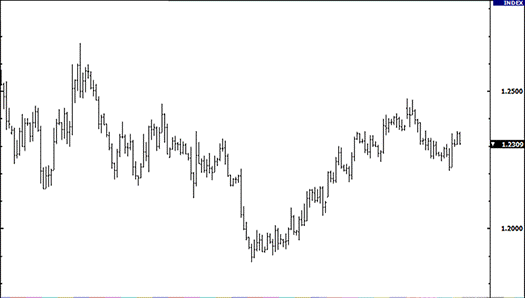
By itself, the bar indicates the trading spectrum of the price of the currency pair as a whole.
The horizontal line on the left of the bar indicates the opening price, on the right – the closing price. Here is an example of a bar chart for EUR/USD:
It should be noted that throughout this lesson you will not see the word “column” in relation to the data presented in the graph.
A column simply represents a specific time segment, e.g., day, week, hour. When you see that the word “column” is used as the main one, then immediately translate for yourself – the time period.
Binary options bar charts are also referred to as “OHLC” charts, as they indicate an opening, above, below, closing for a particular currency. Here’s an example of a graph with columns:
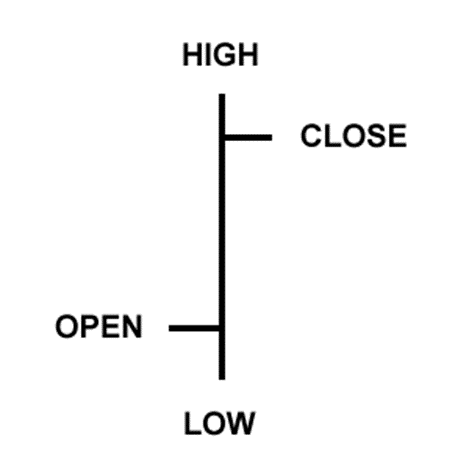
- Open: A small horizontal line on the left indicates the opening price
- Above: The upper part of the vertical line determines the highest price for the time period
- Below: The lower part of the vertical line determines the lowest price for a certain time period
- Closing: The small horizontal line on the right is the closing price
Binary Options Candlestick Chart
Candlestick charts provide the same price information as bar charts, but in a sleeker graphical format.
Candlesticks indicate the spectrum from high to low value with a vertical line.
However, in candlestick charts, large blocks (for the body) in the middle indicate the spectrum between the opening and closing prices. Traditionally, if the block in the middle is filled or colored, then the closing price is higher than the opening price.
In the following example, the fill color is black. In a filled block, the top of the block is the opening price, the bottom of the block is the closing price. If the closing price is higher than the opening price, then the block inside will be white, or unfilled, or unified.
For example, we don’t like traditional black and white candles. They just don’t look that pretty. And since we spend a lot of time idle looking at candlesticks, charts, it is easier for us to look at those charts that are painted in different colors.
Color TV is much better than black and white, so why not paint candlestick charts in different colors?
We just replaced white with green and black with red. This means that if the closing price is higher than the opening price, then the candle will be green.
If the closing price is lower than the opening price, the candle will be red.
In our further tutorials, you will see how red and green candlesticks can be used, how they will give you the opportunity to read charts much faster, for example, see a downtrend or an uptrend, possible turning points.
For today, just remember that on the options charts, we simply use green and red candlesticks instead of black and white, and from now on we will use them.
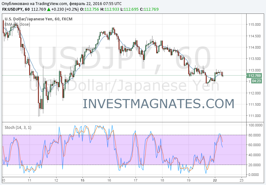
Here is an example of a candlestick chart for EUR/USD. Beautiful, isn’t it?
The purpose of candlesticks is to serve solely as a visual aid, as the same information is provided in a chart with OHLC columns. The advantages of candles are as follows:
Candlesticks are easy to interpret, this is a good way for beginners to start learning how to analyze binary options charts.
Candles are easy to use! Your eye will practically immediately see the information on the columns. Plus, research shows that visual information helps in learning, so it most likely helps in trading!
Candlesticks are good for determining turning points in the market – the reverse movement from the upward movement and the transition to the downward movement, or vice versa, the downward movement turns into an upward movement. You will learn more about this later.
Now that you have learned how cool candlesticks are, it’s time to tell you that candlesticks are most often used for binary options trading.
In binary options trading, the candlestick chart is the most popular. However, we believe that the chart should be consistent with the binary options strategy you are trading. If you don’t use candlesticks in your asset price analysis, you don’t have to use them.
On our portal you will find a live chart of binary options.
- Rating of binary options brokers
- Charts for binary options
Tagged with: Binary Options Chart • Live Chart +for Binary Options