
Article Summary: Charts display price movement, display it graphically, and can be used by traders like you from all over the world. Today, most traders start with candlesticks, but in the Western Hemisphere, this chart is relatively new. Another option is with clear features that will help you see the parts as a whole and trade more efficiently. This article will introduce you to the methods that have been used historically and explain why some traders prefer one candlestick design and others prefer another.
Charts are the starting point for any trader whose decisions are based on technical analysis or analysis of price movements. A price movement chart is nothing more than a graphical display of price movement over a fixed period of time. However, charts help the trader to ask the market about the market, so that the trend becomes clear and the trading opportunities are clearer.
The history of the compilation of garfics
Charts were already in use in the 1700s, when rice traders in Tokyo began to record prices on paper. In particular, they looked at the price over a fixed period of time in order to find trends from which they could profit. To their credit, Japanese technical analysis in the form of candlesticks is the main chart on which the price is analyzed and decisions are made today.
When there was a leap in the development of technology in the 20th century, the basis for brokers and professional traders was the ticker tape with stock quotes. Due to the fact that computers were inaccessible back then, traders read the values from the tape and drew their own charts to see when breakouts would take place if there was a clear pattern. A common saying was that when everything was not in order on the tape, the opportunity was ripe
“I never argue with the tape. Anger in the market will not lead you anywhere.
Larry Livingston, (Jesse Livermore), Memoirs of an operator on the stock exchange.
Today, computers allow traders to handle any kind of chart they want to use in seconds. The goal of every trader using any chart is to find a chart that will help them identify highly profitable opportunities. The chart display can be anything, line, column, candle
Types of charts and their advantages
Candlestick chart for binary options
Candlesticks help traders understand what exactly is behind the price of the day. The technique for this unique display – open, closed, high, low and closed candles consist of a wick and a body.
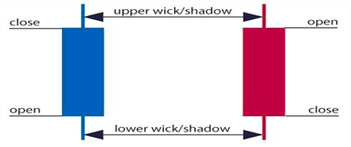
The body shows the main direction of movement, while the wick indicates the exceeded displacement, a movement that will most likely not last long. If the case (open for strong relationships) occupies the main part of the candle, you have a trend candle, as the price closed near the end of the period. If the wick (high for low relations) occupies the main part of the candle, then you are dealing with a flashing signal, so to speak, that is, an unstable, indecisive state that warns that you need to exit trading if you traded depending on the trend, or reconsider and change the direction of trading.
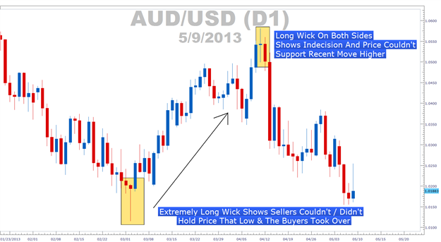
The range of AUDUSD fluctuations depends on the size of the wick that highlights the entry
The Japanese have a saying that fully reflects the work of the candlestick chart: “A candle burns out to give light to a person.” Analysis based on the candlestick chart is significant in the market today. If you want to know what candlestick shapes make up the charts today, our technical analysis tool will scan and present the trading status based on the charts.
Binary Options Chart
A graph with columns provides the same information as candlesticks, but it lacks presentability. A graph with columns accurately displays the opening and closing, low and high positions, but it lacks color. Some traders, who feel that the main thing is information about high/low positions, but do not want to be influenced by the color code, prefer charts with columns to discover simple patterns on which they can trade.
Comparison of charts with bars (left) and candlesticks (right)
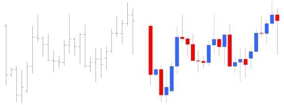
Source: fxwords.com/j/japanese-candlesticks.html
Traders often use a graph with bars to compare the spectrum. If the spectrum of the column is completely within the previous column, or completely outside the previous column, then you are in a time of indecision, which portends big changes.
Line charts
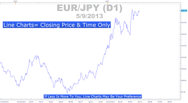
Line graphs provide the least amount of data, but this is not the worst case. Many traders believe that the most important information is the price information for today, and this is where the line chart outperformed all others. The simplicity of the line chart is very important for specific trends.
Learn Forex: Line Charts – Get Rid of Noise and Work Only with Closing Data
Final conclusions
Now you have a good idea of the 3 main forms of graphs. And more importantly, you can also see the benefits of each, so you can choose which one suits you best. At the end of the day, the chart where you’ll be able to best manage risk and find lucrative entry opportunities will most likely work for you more.
Happy trading!
Tagged with: Binary Options Chart • Live Chart +for Binary Options